Impact
Impact answers the only question that matters: what did your copilots change?
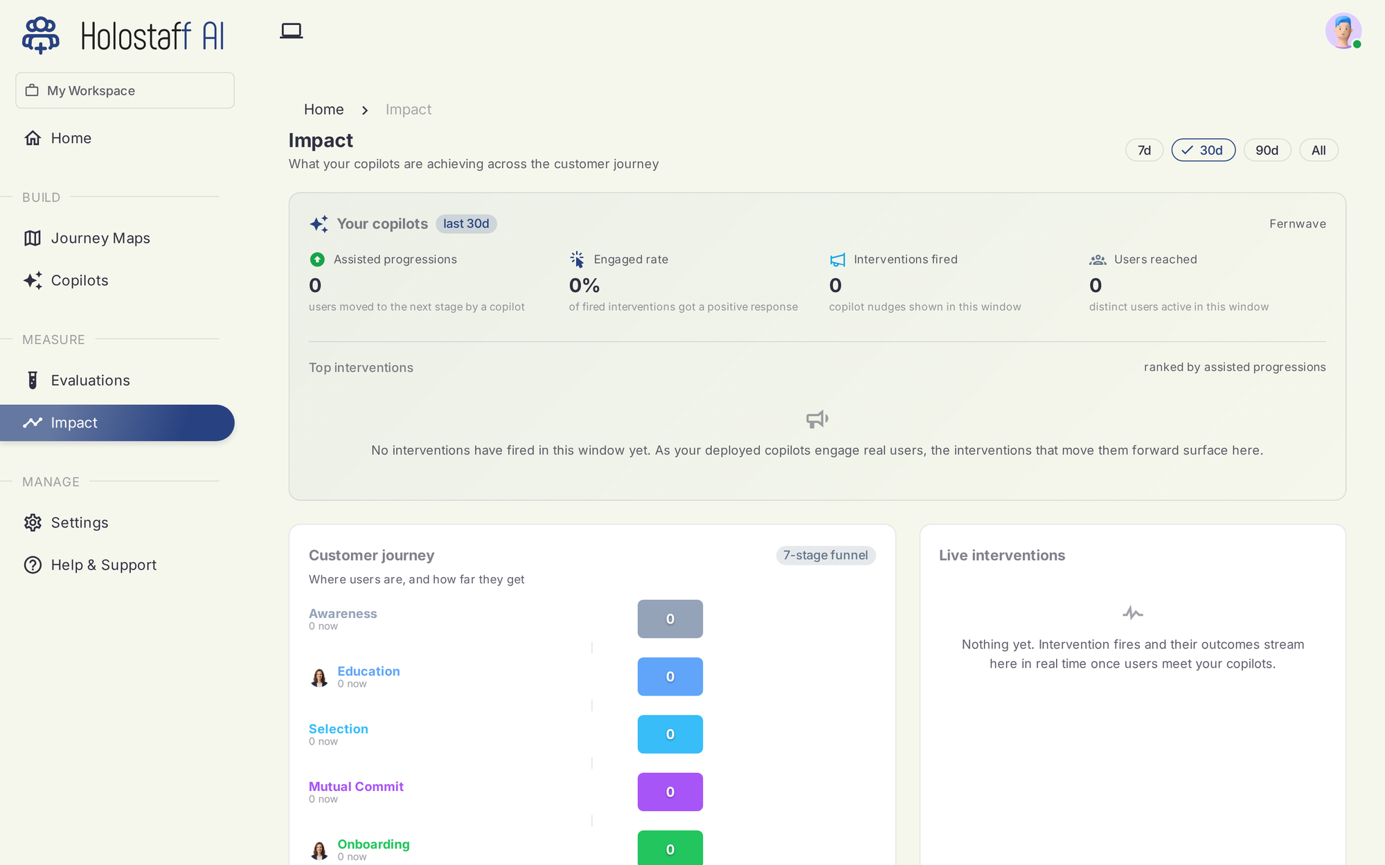
The top line
Four numbers, over a window you pick (7, 30, 90 days, or all time):
- Assisted progressions — users moved to the next stage by a copilot
- Engaged rate — the share of fired interventions that got a positive response
- Interventions fired — copilot nudges shown in the window
- Users reached — distinct users a copilot was active for
Top interventions
Interventions ranked by assisted progressions: which specific nudge, at which risk moment, is actually moving users forward. This is where you learn what to double down on and what to retire.
Customer journey
The funnel across your seven stages, with live counts of where users are now and how they flow between stages. Stage colors match the journey map, so the funnel reads as the same product you scanned.
Live interventions
A real-time feed: each intervention as it fires, with its outcome as it lands. Right after a deploy this is the screen worth watching. It's the fastest way to see your copilot meet its first real user.
Fresh deploys start at zero
Impact attributes only what actually happened. A newly deployed copilot shows zeros until real users engage; there is no synthetic or projected data on this page.